
Page 18 - Lightroom Magazine Issue 26
P. 18
› › lightroom magazine › ›
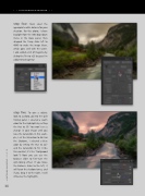
step four: Next, select the appropriate white balance for your situation. For this photo, I chose Daylight from the WB drop-down menu in the Basic panel, then dragged the Temp slider left to 4840 to make the image bluer, which goes well with the water. I also added a bit of magenta by sliding the Tint to +23 because I’m addicted to magenta!
step five: To give a stylistic look to a photo, go into the Split Toning panel. I selected a warm color for the Highlights by setting the Hue to 30. You won’t see a change in your image until you raise the Saturation. In this exam- ple, I set the Saturation to 46. For the Shadows, I selected a blue color by setting the Hue to 227 and the Saturation to 50. (I like this contrast; it’s the “Hollywood look”!) Now you can use the Balance slider to fine-tune the split-toning effect. If you move the Balance slider to the left, it will favor the shadow tones, and if you drag it to the right, it will influence the highlights.
018
› › lightroom magazine › issue 26
