
Page 23 - Lightroom Magazine Issue 27
P. 23
› › lightroom magazine › ›
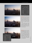
step one: I took this photo in New York, and this is how I re-created this look: First, go to the Basic panel and open up the Shadows to +100, crush the Blacks to –61, blow up the High- lights to +100—we want no detail in the sky—then boost the Contrast to +62.
We’re starting to get the look we want, but the problem is when you boost the contrast you usually get more saturation with it, and we don’t want that. So, the trick is to selectively desaturate.
step two: To do this, head to the HSL/Color/B&W panel, click on HSL, and in the Saturation section, de- saturate all the colors we don’t want. Here, I lowered the Green setting all the way to –76, along with Aqua and Blue. Lower the Purple setting to –69 and Magenta to –67. Since we want to have a warm undertone, boost the Yellow setting to +31, Orange to +32, and Red to +36.
023
› › kelbyone.com
