Page 96 - Photoshop User March 2017
P. 96
› › COLUMN
[ the process ]
DESIGNER
Mario Garza mothandmoon.org
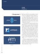
Right away, Garza saw the chance to combine the arrow concept with a strong, upward-pointing variation on the A. “The A is very powerful,” says Garza. His first stabs at the logo included multiple approaches to the letter abstracted into a strong triangular shape, as well as ideas based on other geometric forms (see previous page). Later rounds continued to explore a variety of shapes, but ulti- mately “one of the ones I did first was the one we ended up going with,” says Garza.
He also explored color variations, but the Append team quickly agreed on blue. “That’s when things went into refinement mode,” says Eaton, addressing such questions as how the logo would work in a square, as a Facebook profile picture for instance, and whether the company name should be a formal part of the logo? The refine- ments also included a subtle gradient applied to the blue color and a curve added to the bottom of the shape. The A is “pointy,” in Garza’s words, and “we wanted some- thing to smooth it out a little bit and make it friendlier.”
As for the name of the company, Garza modified the Telegrafico font, designed by Salvo Nicolosi. “Chris really
liked the concept of removing the middle bar of the A,” he says. “It’s a little cleaner and mimics the big A.” It also recalls the way the Tesla logo doesn’t have a vertical bar in the E.
He also saw an opportunity to work with the double P in Append. He thought of adding an arrow somehow, but after trying it, decided to settle for an implied arrow. He took a little notch out of the curve of the P where it joins the stem, cut at the same angle as the A. “It created a little bit of movement,” he says.
Later rounds
[096]
> PHOTOSHOP USER > MARCH 2017


