
Page 96 - Photoshop User February 2017
P. 96
DESIGN MAKEOVER › ›
the process
DESIGNER
Susan LeGrande
susanlegrande.carbonmade.com
LeGrande agreed that the old logo was “definitely out- dated” and needed attention. But first, she wanted to be clear on the scope of the job. “I wasn’t supposed to give them a whole new logo,” she says, having been told that the network just wanted a “refresh.” When she asked what they liked about the current logo or what they might want to keep, they said the color palette but not much else. That opened up the possibility to go further than simply a refresh.
Since any new logo wasn’t supposed to be too radical or far-out, LeGrande started looking for a type treatment solution based on a new font. “I quickly ended up with the font Rockwell because the p, o, and d each have a circle,” she says. That let her play with connecting the circles in ways that would recall the current logo’s bubbles.
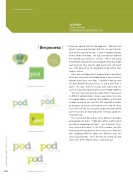
She then started putting the word POD (in lowercase) in different configurations: inside square boxes or circles, in a word balloon, in front of three bubbles, outlined or in color, and so on. She sent that first round of variations to Haugnes to discuss just between the two of them.
“I sent her stuff for her eyes only, to get direction and to give her an idea of how broad the redesign could be,” LeGrande says.
The next round focused on three different directions and variations on those. “I took some of the stuff she liked and did an exploration of those,” says LeGrande. These were shared with others in the POD network. And the final round was based on the three letters in the Rockwell font, exploring different colors and different ways the letters could overlap. “The idea that we ended up with wasn’t one of the original ideas,” LeGrande says
Examples from Round 1
Examples from Round 2
096
Examples from Round 3
› › photoshop user › february 2017
