
Page 59 - Photoshop User February 2017
P. 59
Fortunately, digital images are made up of pixels that come with a defined size, so that takes care of how to measure distance (just not how much distance matters). And each pixel has a single value of color and brightness. If we’re only looking at two pixels, we can easily see any differences, and the boundary is pretty clear. Adding more pixels makes it a bit more challenging.
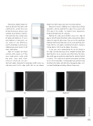
Now let’s imagine one black
and one white square as if they
were single pixels—really, really
big pixels. Since pixels them-
selves are a fixed size, we can’t
do much about changing the boundary width unless we add more pixels to the edge width. But we can choose
Flat
brighter or darker gray values by increasing contrast. Now pretend we’re looking at an edge between black and white, and the width of the edge is three pixels with 50% gray in the middle. I’ve added Curves adjustments
below to demonstrate the changes.
Making the edge pixels brighter causes the edge to
appear to shift toward the black, while making them darker moves the edge the other way. You can test this quickly by moving further back from your screen, and squinting a bit. If you do this, tell anyone watching that you’re having a staring contest. Ask them to choose the winner.
In any case, we’re manipulating the rate of change in the edge. Instead of being a linear, smooth transition from black to white, we’ve created a curve that makes the transi- tion width appear smaller by adjusting the contrast (which is relative). This really has to do with perception and how we see these transitions. Creating too much contrast leads to artifacts like halos, and sometimes to jagged edges. Let’s see how Photoshop actually performs sharpening.
Brightened
› › PHOTOSHOP PROVING GROUND
Darkened
Contrast
059
› › kelbyone.com
